---
title: "The normal model and z-scores"
author: "Evan L. Ray"
date: "September 20, 2017"
output: ioslides_presentation
---
```{r setup, include=FALSE}
knitr::opts_chunk$set(echo = FALSE)
require(ggplot2)
require(dplyr)
require(tidyr)
require(readr)
```
## Warmup with a neighbor (~10 min)
* What are the observational units, variable(s), and variable type(s) in each plot?
* What did the code I used to make the plots look like?
* What statistics should we use for the center and spread?
```{r, echo=FALSE, message=FALSE, fig.height = 1.75, fig.width=4}
car_speeds <- read_csv("https://mhc-stat140-2017.github.io/data/sdm3/Chapter_06/Ch06_Car_speeds.csv")
colnames(car_speeds) <- "speed"
ggplot() +
geom_density(mapping = aes(x = speed), data=car_speeds) +
# geom_histogram(mapping = aes(x = speed), data=car_speeds) +
ggtitle("Car speeds in a 20 MPH zone")
```
```{r, echo=FALSE, message = FALSE, fig.height = 1.75, fig.width=4}
lake_huron <- read_csv("https://mhc-stat140-2017.github.io/data/mosaic/lake_huron.csv")
ggplot() +
geom_density(mapping = aes(x = water_level), data=lake_huron) +
# geom_histogram(mapping = aes(x = water_level), data=lake_huron) +
ggtitle("Annual Lake Huron water levels, 1875-1972")
```
```{r, echo=FALSE, message = FALSE, fig.height = 1.75, fig.width=4}
pizza <- read_csv("https://mhc-stat140-2017.github.io/data/sdm3/Chapter_04/Ch04_Pizza_Prices.csv")
ggplot() +
geom_density(mapping = aes(x = Price), data=pizza) +
# geom_histogram(mapping = aes(x = Price), data=pizza) +
ggtitle("Prices of plain pizza slices in Dallas, TX")
```
## All three are Nearly Normal
* **The Nearly Normal** condition:
* Distribution is unimodal
* Distribution is (approximately) symmetric
```{r, echo=FALSE, message=FALSE, fig.height = 1.75, fig.width=4}
car_speeds <- read_csv("https://mhc-stat140-2017.github.io/data/sdm3/Chapter_06/Ch06_Car_speeds.csv")
colnames(car_speeds) <- "speed"
ggplot() +
geom_density(mapping = aes(x = speed), data=car_speeds) +
stat_function(mapping = aes(x =speed),
fun = dnorm,
colour = "red",
args = list(mean = mean(car_speeds$speed), sd = sd(car_speeds$speed)),
data =car_speeds) +
# geom_histogram(mapping = aes(x = speed), data=car_speeds) +
ggtitle("Car speeds in a 20 MPH zone")
```
```{r, echo=FALSE, message = FALSE, fig.height = 1.75, fig.width=4}
lake_huron <- read_csv("https://mhc-stat140-2017.github.io/data/mosaic/lake_huron.csv")
ggplot() +
geom_density(mapping = aes(x = water_level), data=lake_huron) +
stat_function(mapping = aes(x = water_level),
fun = dnorm,
colour = "red",
args = list(mean = mean(lake_huron$water_level), sd = sd(lake_huron$water_level)),
data = lake_huron) +
# geom_histogram(mapping = aes(x = water_level), data=lake_huron) +
ggtitle("Annual Lake Huron water levels, 1875-1972")
```
```{r, echo=FALSE, message = FALSE, fig.height = 1.75, fig.width=4}
pizza <- read_csv("https://mhc-stat140-2017.github.io/data/sdm3/Chapter_04/Ch04_Pizza_Prices.csv")
ggplot() +
geom_density(mapping = aes(x = Price), data = pizza) +
stat_function(mapping = aes(x = Price),
fun = dnorm,
colour = "red",
args = list(mean = mean(pizza$Price), sd = sd(pizza$Price)),
data = pizza) +
# geom_histogram(mapping = aes(x = Price), data=pizza) +
ggtitle("Prices of plain pizza slices in Dallas, TX")
```
## Why does this matter?
* For any variable with a nearly normal distribution, we can use the same rules to calculate:
1. Percentiles/quantiles
2. The proportion of the data that are less than a given value.
* Lots of variables have a nearly normal distribution!
## The normal model
* $N(\mu, \sigma)$
* Read: "normal distribution with mean $\mu$ and standard deviation $\sigma$"
* $\mu$ and $\sigma$ are **parameters**
```{r, echo = FALSE, fig.height=2.5}
x_grid <- seq(from = -5, to = 5, by = 0.01)
n_grid <- length(x_grid)
mu1 <- 0
sigma1 <- 1
mu2 <- 1
sigma2 <- 0.2
mu3 <- -2
sigma3 <- 2
plot_df <- data.frame(
x = rep(x_grid, 3),
density = c(dnorm(x_grid, mean = mu1, sd = sigma1), dnorm(x_grid, mean = mu2, sd = sigma2), dnorm(x_grid, mean = mu3, sd = sigma3)),
parameters = c(rep("mu = 0, sigma = 1", n_grid), rep("mu = 1, sigma = 0.2", n_grid), rep("mu = -2, sigma = 2", n_grid))
)
ggplot() +
geom_line(aes(x = x, y = density, color = parameters), data = plot_df)
```
* To use the model with real data, we estimate $\mu$ and $\sigma$ with the sample mean $\bar{y}$ and standard deviation $s$
## Example
```{r, echo = TRUE}
summarize(car_speeds, mean_speed = mean(speed), sd_speed = sd(speed))
```
* Example: red curve is a $N(23.8, 3.6)$ distribution
```{r, echo = FALSE, fig.height=2.5}
normal_mean <- 23.8
normal_sd <- 3.6
ggplot() +
geom_density(mapping = aes(x = speed), data=car_speeds) +
stat_function(mapping = aes(x =speed),
fun = dnorm,
colour = "red",
args = list(mean = normal_mean, sd = normal_sd),
data = car_speeds) +
scale_x_continuous(
breaks = c(15, 25, 35, normal_mean + seq(from = -1, to = 1)*normal_sd),
labels = c(15, 25, 35, expression(paste(mu, " - ", sigma)), expression(paste(mu)), expression(paste(mu, " + ", sigma)))) +
# breaks = c(15, 20, 25, 30, 35, mean(car_speeds$speed) + seq(from = -3, to = 3)*sd(car_speeds$speed)),
# labels = c(15, 20, 25, 30, 35, expression(paste(mu, " - 3", sigma)), expression(paste(mu, " - 2", sigma)), expression(paste(mu, " - 1", sigma)), expression(paste(mu)), expression(paste(mu, " + 1", sigma)), expression(paste(mu, " + 2", sigma)), expression(paste(mu, " + 3", sigma)))) +
# geom_histogram(mapping = aes(x = speed), data=car_speeds) +
ggtitle("Car speeds in a 20 MPH zone") +
theme_gray(base_size = 16)
```
## The **68-95-99.7 rule**:
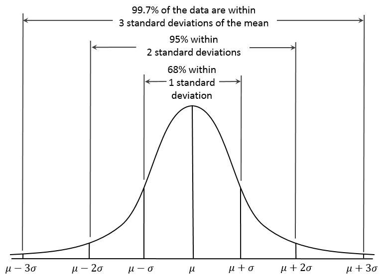{width=3in height=3in}
## Examples: Using the 68-95-99.7 rule
```{r, echo = FALSE, fig.height=2.5}
normal_mean <- 23.8
normal_sd <- 3.6
ggplot() +
geom_density(mapping = aes(x = speed), data=car_speeds) +
stat_function(mapping = aes(x =speed),
fun = dnorm,
colour = "red",
args = list(mean = mean(car_speeds$speed), sd = sd(car_speeds$speed)),
data = car_speeds) +
geom_vline(xintercept = normal_mean - 3*normal_sd, color = "red") +
geom_vline(xintercept = normal_mean - 2*normal_sd, color = "red") +
geom_vline(xintercept = normal_mean - 1*normal_sd, color = "red") +
geom_vline(xintercept = normal_mean, color = "red") +
geom_vline(xintercept = normal_mean + 1*normal_sd, color = "red") +
geom_vline(xintercept = normal_mean + 2*normal_sd, color = "red") +
geom_vline(xintercept = normal_mean + 3*normal_sd, color = "red") +
scale_x_continuous(
breaks = c(15, 25, 35, normal_mean + seq(from = -3, to = 3)*normal_sd),
labels = c("", "", "", round(normal_mean + seq(from = -3, to = 3)*normal_sd, 1))) +
# breaks = c(15, 20, 25, 30, 35, mean(car_speeds$speed) + seq(from = -3, to = 3)*sd(car_speeds$speed)),
# labels = c(15, 20, 25, 30, 35, expression(paste(mu, " - 3", sigma)), expression(paste(mu, " - 2", sigma)), expression(paste(mu, " - 1", sigma)), expression(paste(mu)), expression(paste(mu, " + 1", sigma)), expression(paste(mu, " + 2", sigma)), expression(paste(mu, " + 3", sigma)))) +
# geom_histogram(mapping = aes(x = speed), data=car_speeds) +
ggtitle("Car speeds in a 20 MPH zone") +
theme_gray(base_size = 16)
```
* If driver speeds in a 20 MPH speed zone can be represented by a $N(23.8, 3.6)$ model, find the following:
* The proportion of drivers who drive between 20.2 and 27.6 MPH.
* The proportion of drivers who drive less than 20.2 MPH
* The 2.5th percentile of driver speeds
* The 50th percentile of driver speeds
## Your turn: Using the 68-95-99.7 rule
```{r, echo = TRUE}
summarize(pizza, mean_price = mean(Price), sd_price = sd(Price))
```
```{r, echo = FALSE, fig.height=2.5}
normal_mean <- 2.62
normal_sd <- 0.16
ggplot() +
geom_density(mapping = aes(x = Price), data=pizza) +
stat_function(mapping = aes(x =Price),
fun = dnorm,
colour = "red",
args = list(mean = normal_mean, sd = normal_sd),
data = pizza) +
geom_vline(xintercept = normal_mean - 3*normal_sd, color = "red") +
geom_vline(xintercept = normal_mean - 2*normal_sd, color = "red") +
geom_vline(xintercept = normal_mean - 1*normal_sd, color = "red") +
geom_vline(xintercept = normal_mean, color = "red") +
geom_vline(xintercept = normal_mean + 1*normal_sd, color = "red") +
geom_vline(xintercept = normal_mean + 2*normal_sd, color = "red") +
geom_vline(xintercept = normal_mean + 3*normal_sd, color = "red") +
scale_x_continuous(
breaks = c(15, 25, 35, normal_mean + seq(from = -3, to = 3)*normal_sd),
labels = c("", "", "", round(normal_mean + seq(from = -3, to = 3)*normal_sd, 2))) +
# breaks = c(15, 20, 25, 30, 35, mean(car_speeds$speed) + seq(from = -3, to = 3)*sd(car_speeds$speed)),
# labels = c(15, 20, 25, 30, 35, expression(paste(mu, " - 3", sigma)), expression(paste(mu, " - 2", sigma)), expression(paste(mu, " - 1", sigma)), expression(paste(mu)), expression(paste(mu, " + 1", sigma)), expression(paste(mu, " + 2", sigma)), expression(paste(mu, " + 3", sigma)))) +
# geom_histogram(mapping = aes(x = speed), data=car_speeds) +
ggtitle("Pizza prices") +
theme_gray(base_size = 16)
```
## Your turn: Using the 68-95-99.7 rule
```{r, echo = FALSE, fig.height=2.5}
normal_mean <- 2.62
normal_sd <- 0.16
ggplot() +
geom_density(mapping = aes(x = Price), data=pizza) +
stat_function(mapping = aes(x =Price),
fun = dnorm,
colour = "red",
args = list(mean = normal_mean, sd = normal_sd),
data = pizza) +
geom_vline(xintercept = normal_mean - 3*normal_sd, color = "red") +
geom_vline(xintercept = normal_mean - 2*normal_sd, color = "red") +
geom_vline(xintercept = normal_mean - 1*normal_sd, color = "red") +
geom_vline(xintercept = normal_mean, color = "red") +
geom_vline(xintercept = normal_mean + 1*normal_sd, color = "red") +
geom_vline(xintercept = normal_mean + 2*normal_sd, color = "red") +
geom_vline(xintercept = normal_mean + 3*normal_sd, color = "red") +
scale_x_continuous(
breaks = c(15, 25, 35, normal_mean + seq(from = -3, to = 3)*normal_sd),
labels = c("", "", "", round(normal_mean + seq(from = -3, to = 3)*normal_sd, 2))) +
# breaks = c(15, 20, 25, 30, 35, mean(car_speeds$speed) + seq(from = -3, to = 3)*sd(car_speeds$speed)),
# labels = c(15, 20, 25, 30, 35, expression(paste(mu, " - 3", sigma)), expression(paste(mu, " - 2", sigma)), expression(paste(mu, " - 1", sigma)), expression(paste(mu)), expression(paste(mu, " + 1", sigma)), expression(paste(mu, " + 2", sigma)), expression(paste(mu, " + 3", sigma)))) +
# geom_histogram(mapping = aes(x = speed), data=car_speeds) +
ggtitle("Pizza prices") +
theme_gray(base_size = 16)
```
* If the cost of a slice of pizza can be represented by a $N(2.62, 0.16)$ model, find the following:
* The proportion of pizza shops where a slice of pizza costs less than $2.30.
* The 84th percentile of pizza slice costs
* A lower and upper bound on the 99th percentile of pizza slice costs
## $z$-scores
* To calculate percentiles, we only need to know the number of standard devations above or below the mean a particular value is.
* This is the $z$-score:
$$z = \frac{y - \mu}{\sigma}$$
## $z$-scores: examples
* Ex: Suppose a police officer pulls over someone who was going 31MPH in a 20MPH zone. Assume a $N(23.8, 3.6)$ model applies.
* How many standard deviations above the mean was that driver going?
* What percentile of driving speeds were they at?
* Ex: Suppose a slice of pizza costs $2.94. Assume a $N(2.62, 0.16)$ model applies.
* How many standard deviations above the mean did that piece of pizza cost?
* What percentile of costs was that slice at?
* Apparently, driving 31 MPH in a 20 MPH zone is as rare as getting a slice of pizza for $2.94
## The normal model in R: quantiles
* Use `qnorm` to calculate **q**uantiles (remember -- essentially the same thing as percentiles)
* What is the 90th percentile of speeds in a 20 MPH speed zone? Assume a $N(23.8, 3.6)$ model applies.
```{r, echo = TRUE}
qnorm(p = 0.90, mean = 23.8, sd = 3.6)
```
## The normal model in R: proportions
* Use `pnorm` to calculate **p**roportion of data that are less than a particular value
* What proportion of drivers travel less than 30 MPH?
```{r, echo = TRUE}
pnorm(q = 30, mean = 23.8, sd = 3.6)
```
* For you to do (draw a picture!):
* What proportion of drivers travel **more than** 30 MPH?
* What proportion of drivers travel **between** 20 and 25 MPH?
## Summary
1. Everything in this chapter is for
* one quantitative variable
* that satisfies the nearly normal condition (unimodal, symmetric)
2. There are 2 basic types of calculations:
* Find a percentile/quantile
* Find the proportion of the data that are in a given range of values.
3. We can do calculations using either:
* The 68-95-99.7 rule -- often only approximate
* R (`qnorm` for quantiles, `pnorm` for proportion of data less than a given number)